

BBC News Infographics
Information Design | Data Visualisation | Illustration | Visual Guidelines
I led the development of a new visual approach for BBC News infographics, creating a flexible set of guidelines for producing clear, engaging and recognisably BBC content across the News website and social platforms.
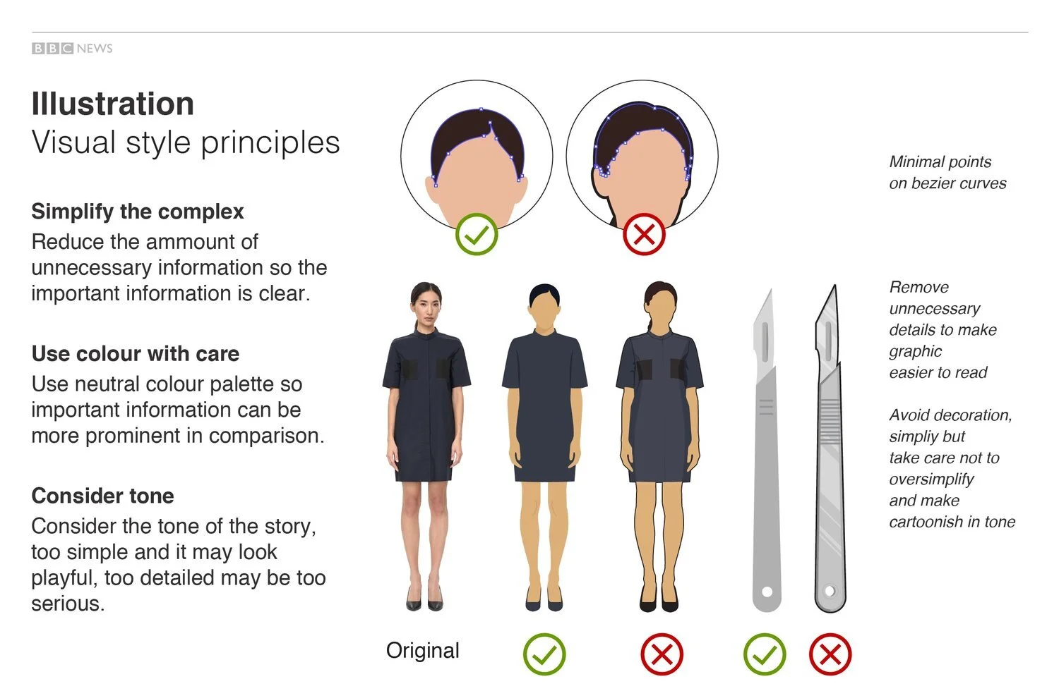
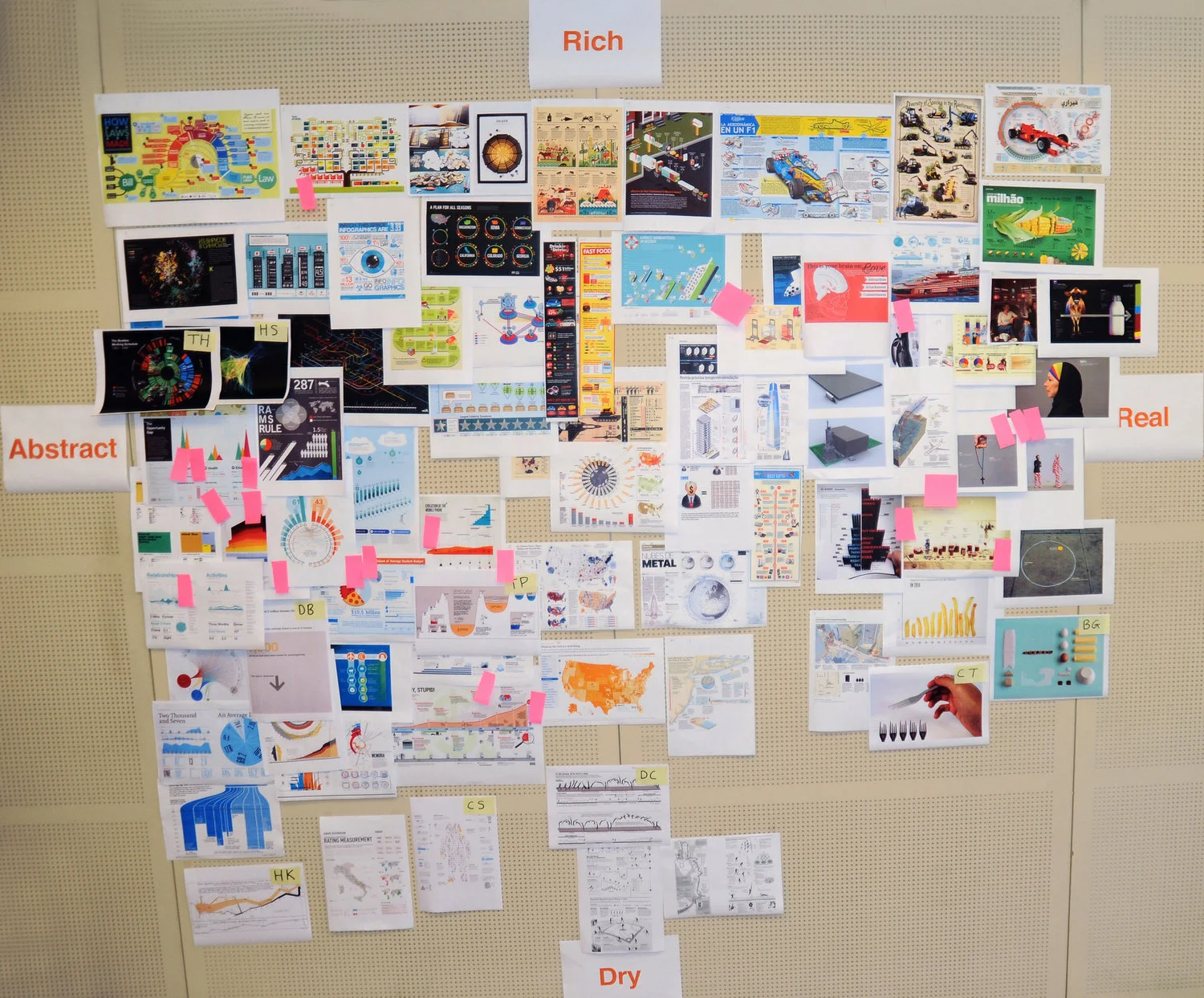
Through collaborative workshops and visual experimentation, we explored how illustration, data visualisation and different levels of complexity could be used across a wide range of stories. The resulting system was deliberately adaptable: neutral enough to let the information lead, but with enough character and playfulness to capture attention.
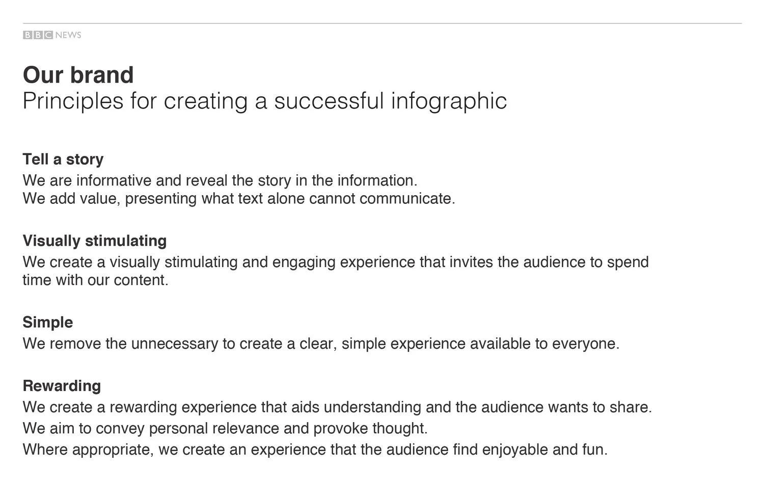
Rather than prescribing a single visual style, the guidelines provided practical principles and a framework that designers could apply according to the subject, audience and format. They were shared across the BBC and went on to inform templates and visual approaches used by other teams and products.
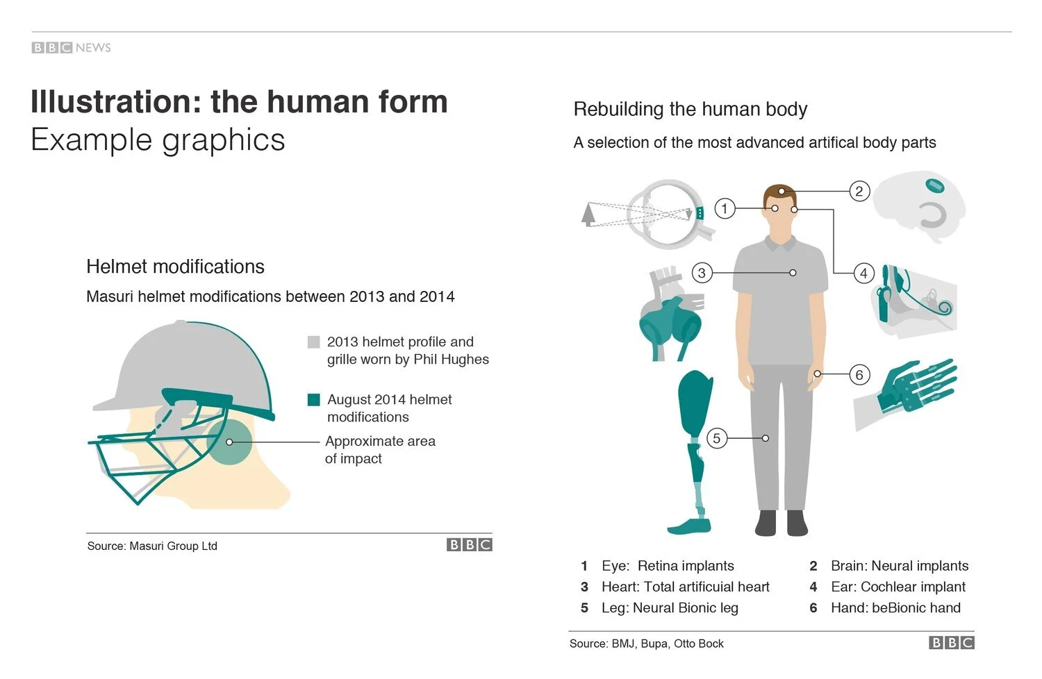
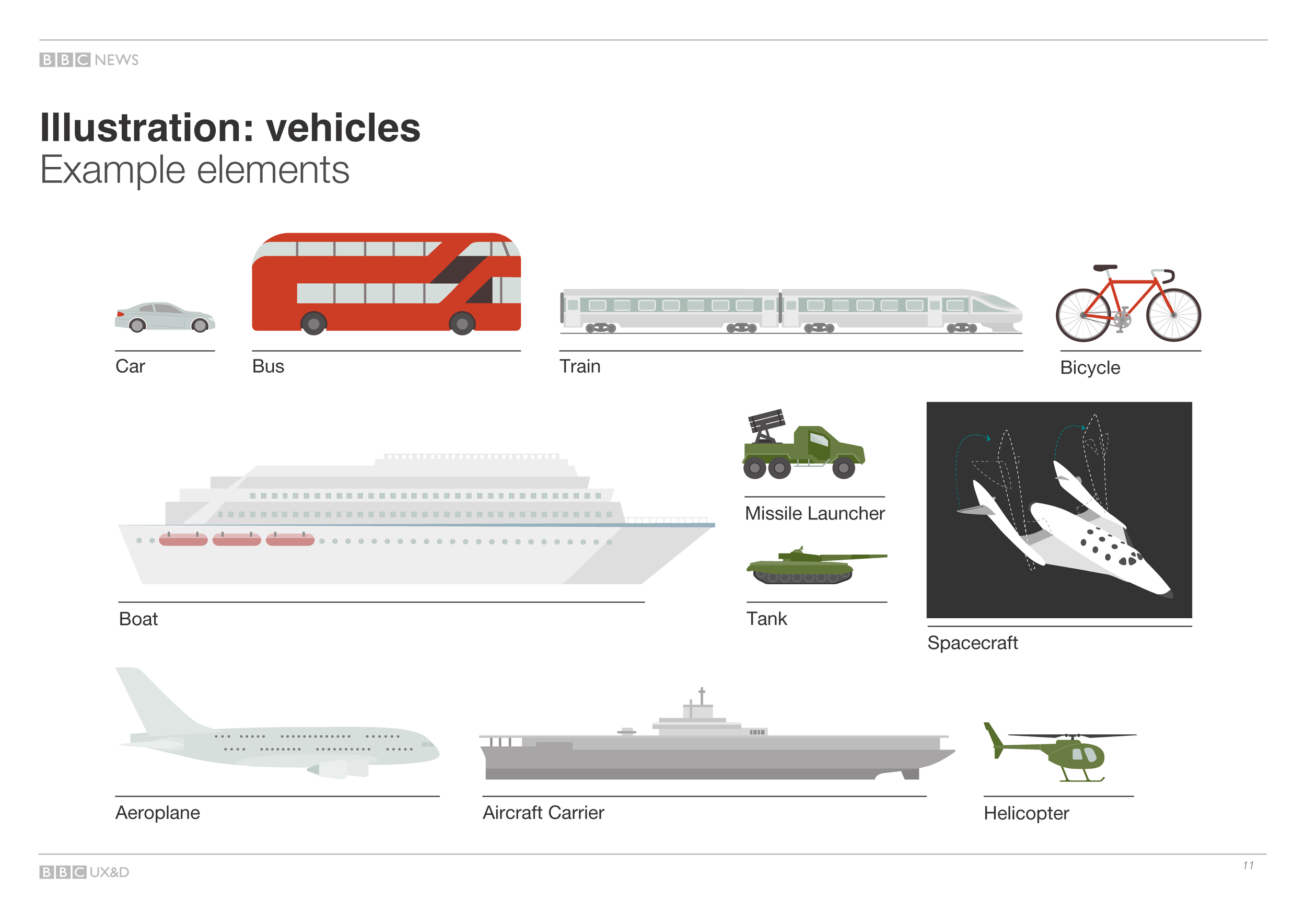
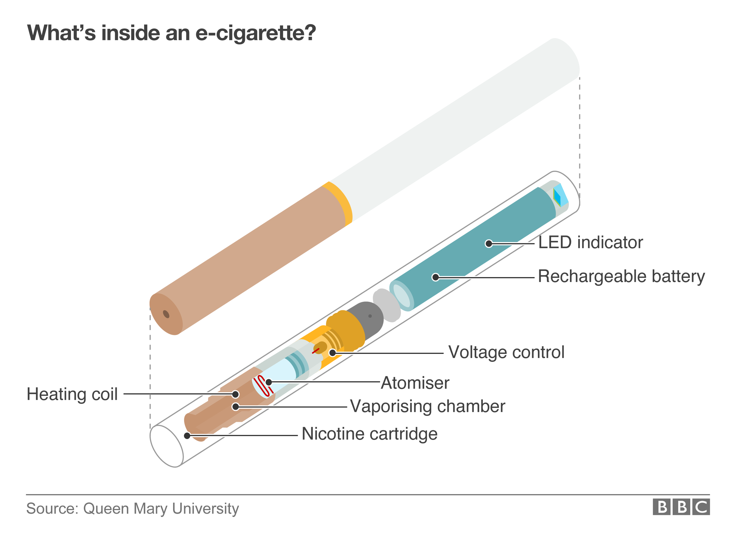
Shown here is a selection of infographics created using the new system. The full guidance is published on the BBC’s GEL website under How to Design Infographics.